EXTENSIS CONNECT
Connect Fonts
Challenge
Extensis' TeamSync (font manager) has been its most used and loved product for decades. However, as technology has developed and digital needs have changed the product was falling behind on updates and becoming cloud-based. As this shift begins, we have to ensure to bring the most necessary features to the web and ensure that crucial tasks can be completed. In addition, improve on tools that they are starting to use in other complementary font products and create a one-stop-shop for font discovery and management.
OBJECTIVES
- Transfer a legacy desktop product into a web, cloud-based tool.
- Modernize the font management tool that has been around for 20+ years without scaring legacy users from the interface that has been so familiar to them for years.
PROJECT SCOPE
Web Application (linked to desktop app)
TOOLS
Adobe XD, Pendo, Mural
ROLE
UX Designer II (Research, Interface design, Interaction design, design system, usability testing)
DURATION
3+ years
Personas
Extensis Connect has several types of personas that it caters to but for this part of the product, Connect Fonts, we will focus on two: the designer and the owner.
It is important to note that Extensis Connect is being built primarily for creative agencies of sizes between 2-25 people.
THE DESIGNER
The designer needs speed, efficiency and to get to their designs. They need the fonts they have access to to "just work". Their focus is to find the perfect font, auto-activate it and get to work.
THE OWNER / MANAGER / CREATIVE
At small agencies, we know that owners will usually also take on creative work. the owner will likely want the same as the designer but, they also want more control on what fonts are being used and shared. They want to be able to organize fonts into libraries and provide ease to their designers.
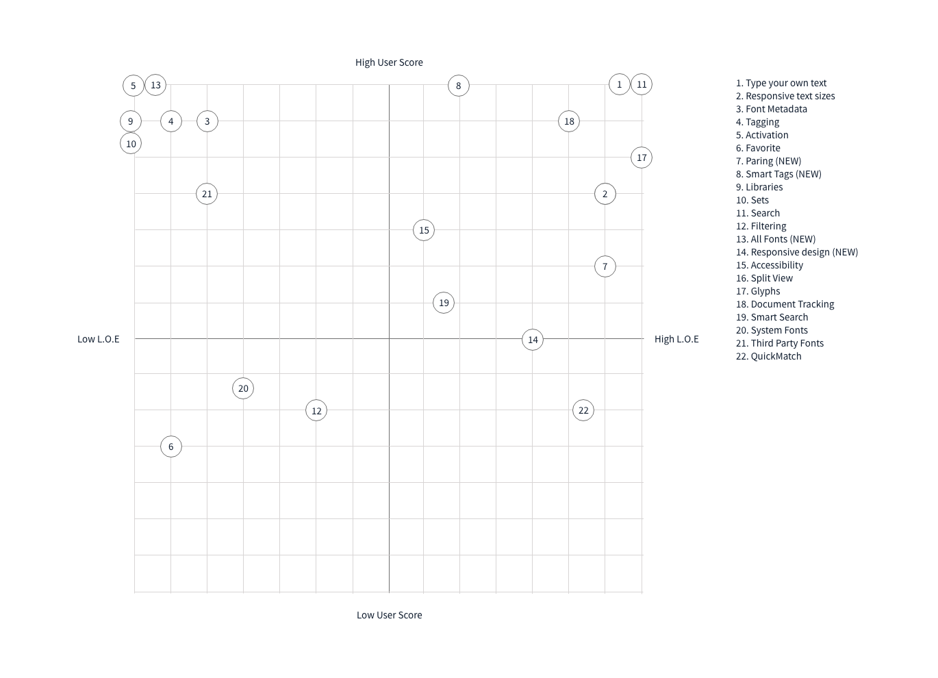
Decision Matrix
Using a decision matrix to make informed decisions about all the old and new features that could migrate to the web Connect Fonts was important as we couldn't deliver all features at once. Using the knowledge we had from the research done, I created the above graph to help with decision making as we moved froward.
Research
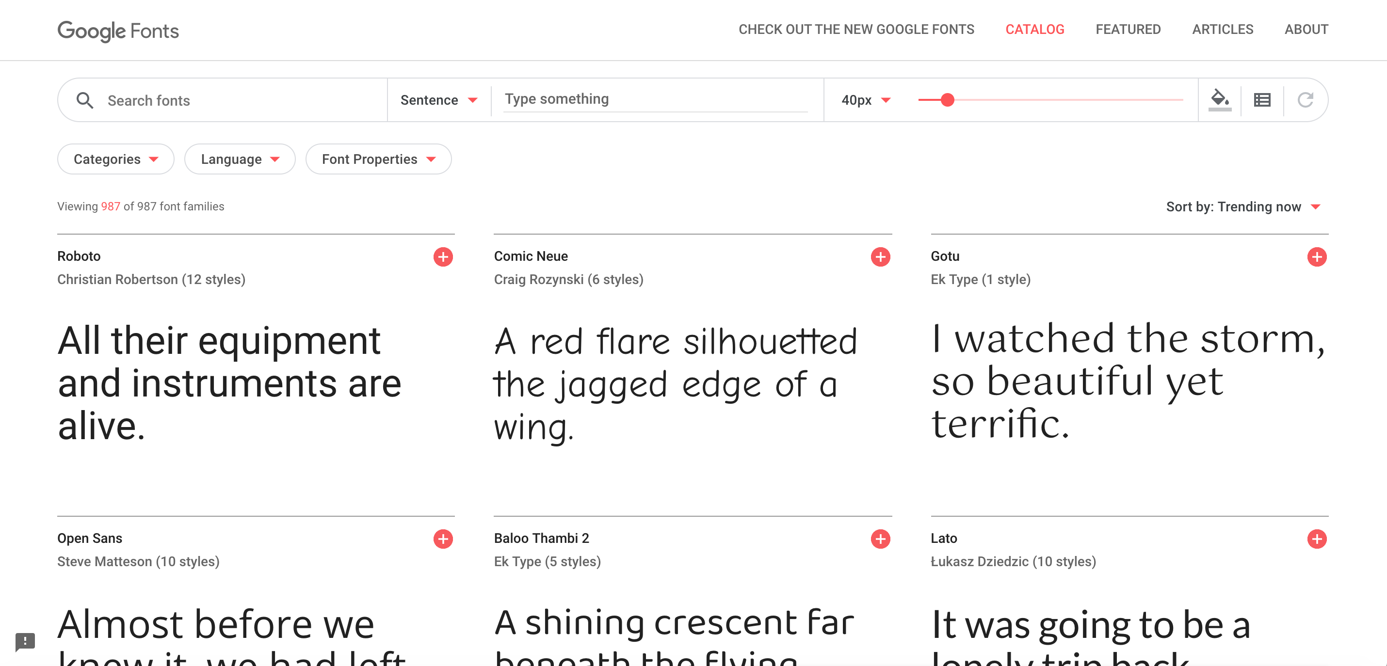
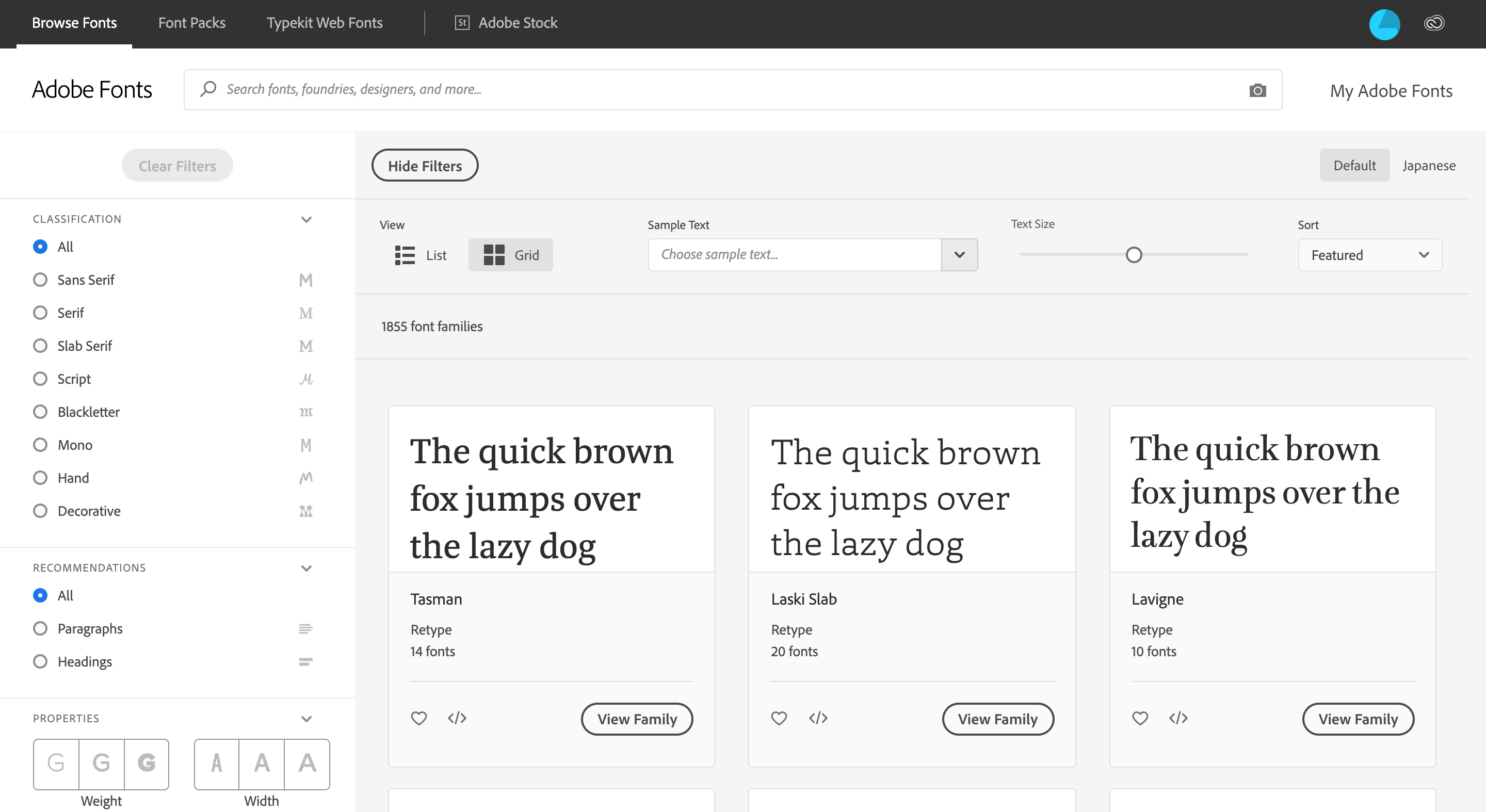
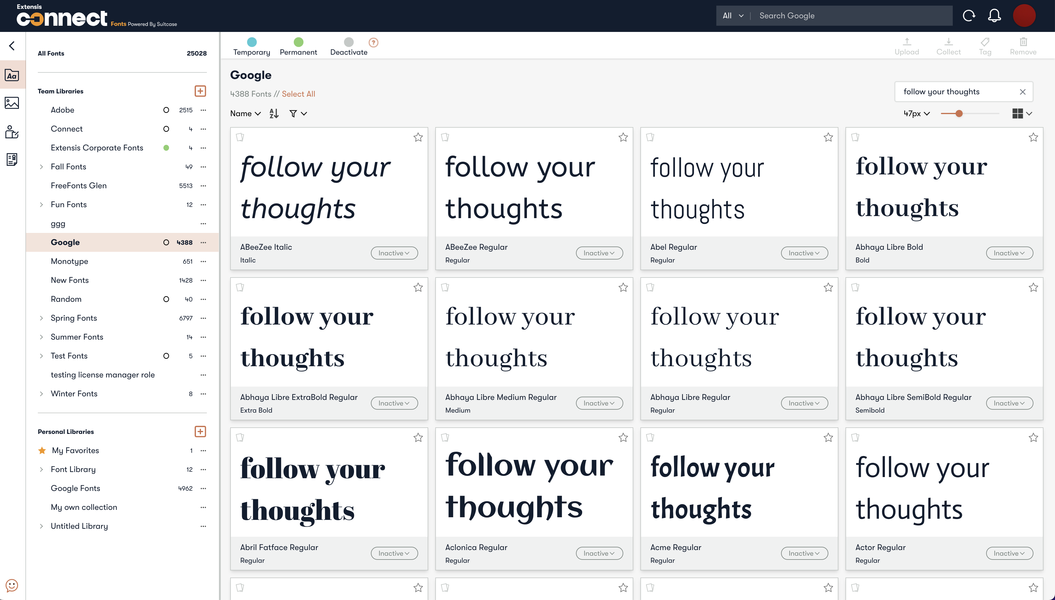
Examples of how fonts are presented in other web-based platforms
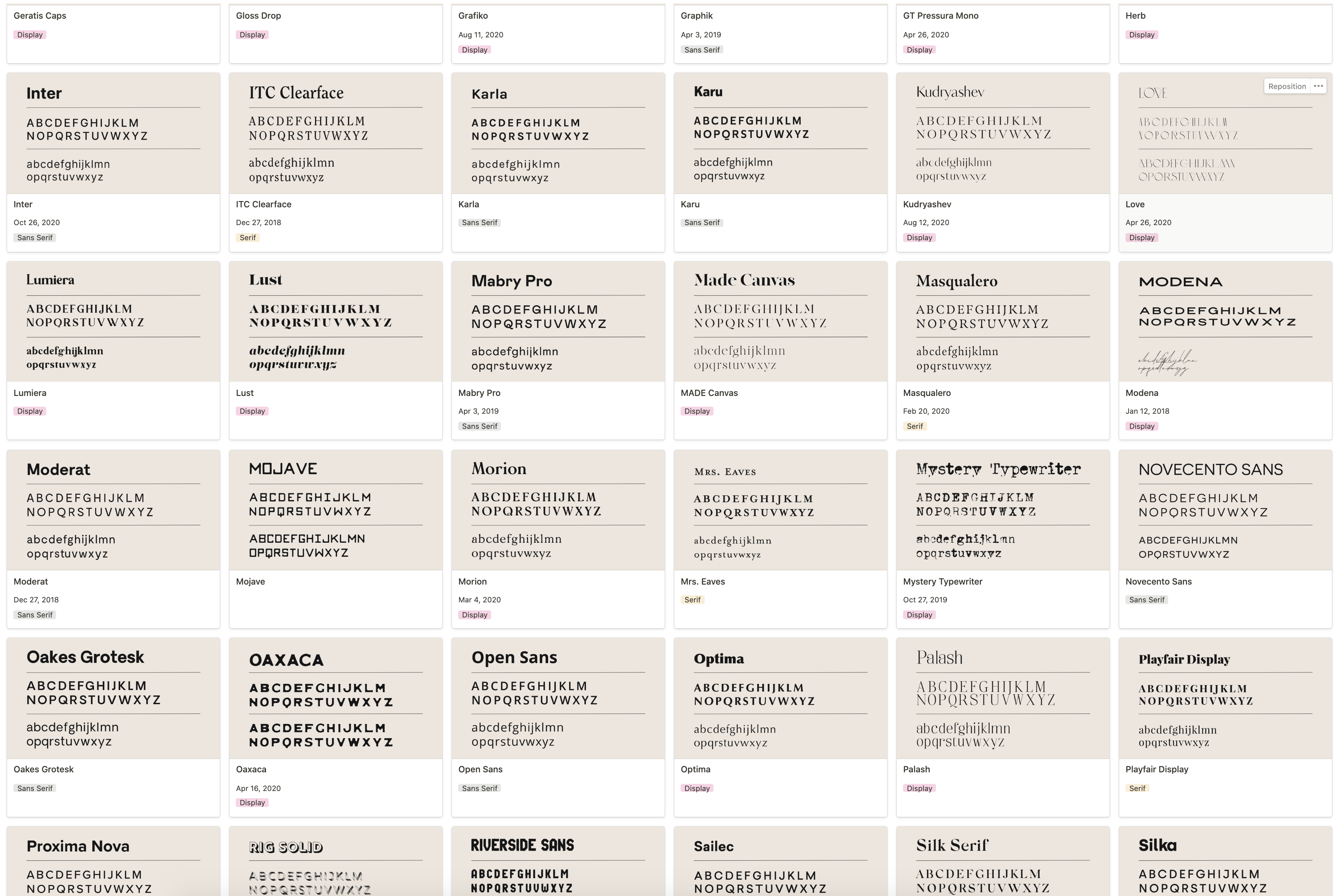
Freelance designers notion page makeshift font manager
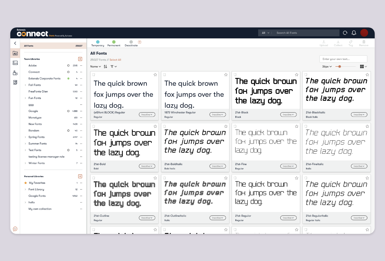
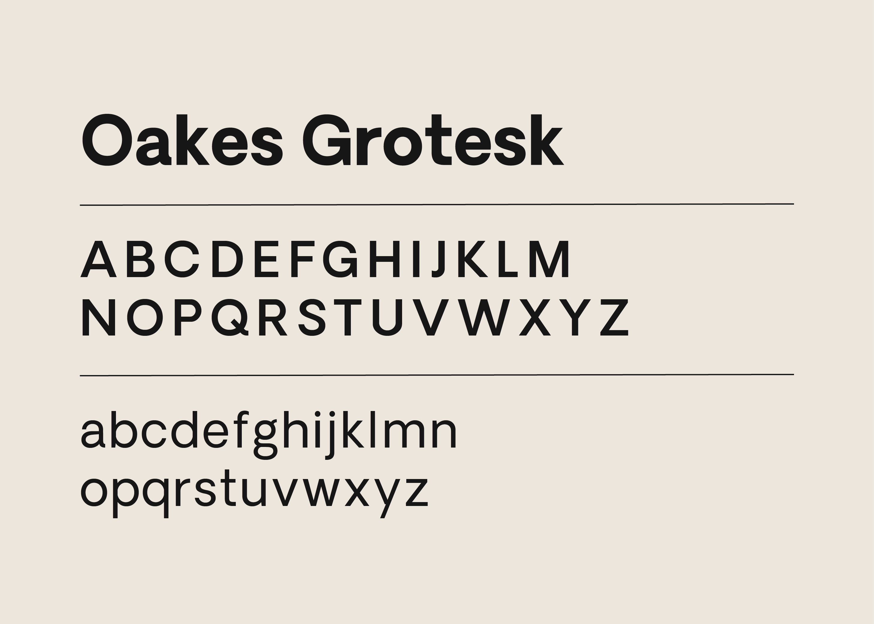
ANATOMY OF DISPLAYING FONTS
Looking at how competitors and people in the font space were presenting fonts on the web today was important while looking to modernize TeamSync (now Connect Fonts). It was important to make sure that users felt familiar with the new space and the best way to do that was to take inspiration from those that have already moved into the web space that our same users already utilize frequently. I looked at the key players: Adobe Fonts, Google Fonts, Creative Marketplace, MyFonts, and 101Fonts.
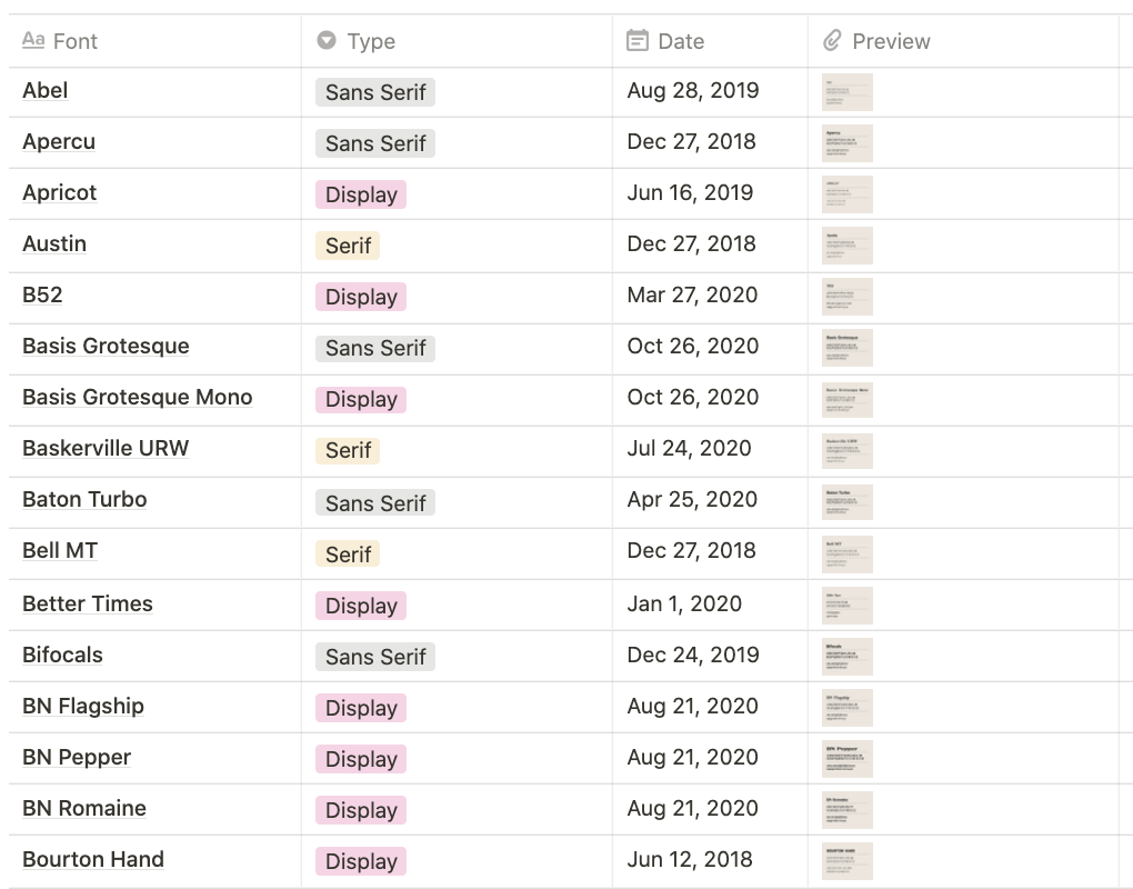
Another interesting player in my research was a freelance designer that I knew that had created her own makeshift font manager, as she did not know that font managers existed. I analyzed her work of presenting her fonts on Notion and the information she found most necessary: displaying the font text in lower and upper case, font name, font classification, and date added.
CUSTOMER VOICE
I used the following techniques to ensure that the customer's voice was involved in design decisions and assumptions:
- Direct calls
- Direct feedback through the web client
- Tweet monitoring
- Wireframe walk-throughs
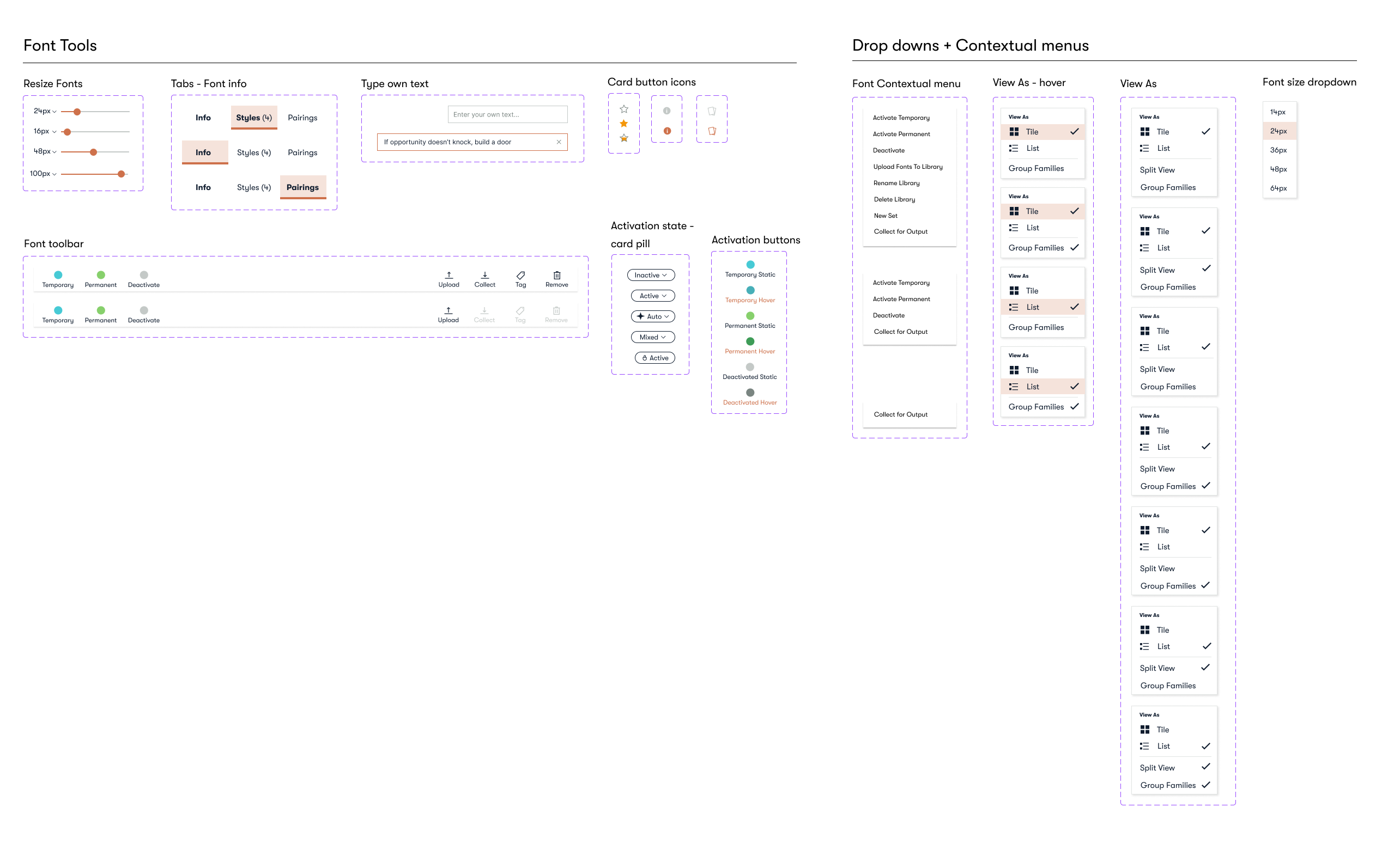
Design System
There had been a recent rebranding of the company that included brand identity guidelines owned by the marketing/creative team. We collaborated closely with them to create the iconography, utilize their colors, and choose how to style items like buttons and miscellaneous items on the product. We aimed to maintain visual consistency with our website but accommodate and adapt to the product's needs. One of the more significant differences between the two is the spacing and sizing of both text and buttons.
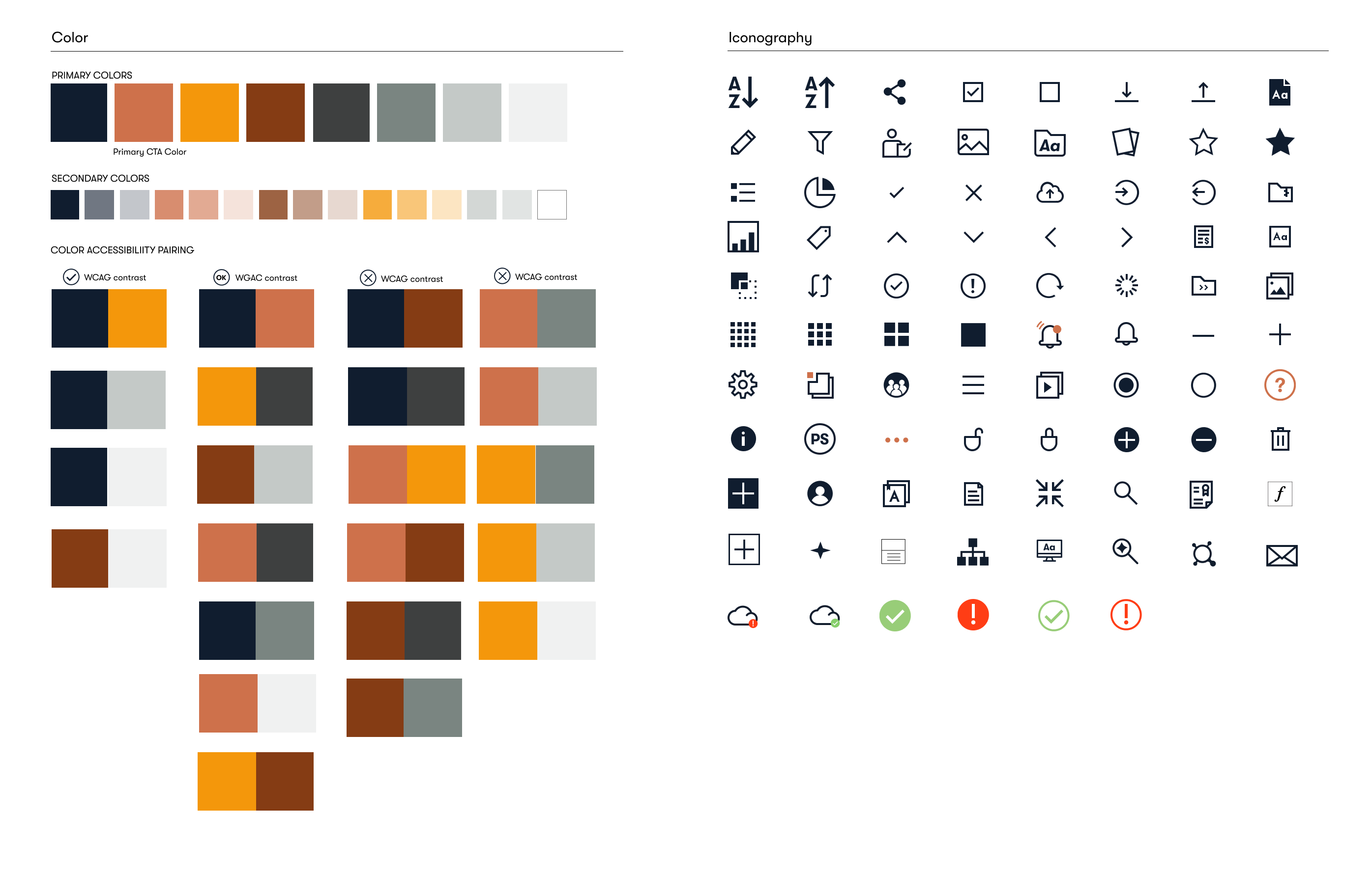
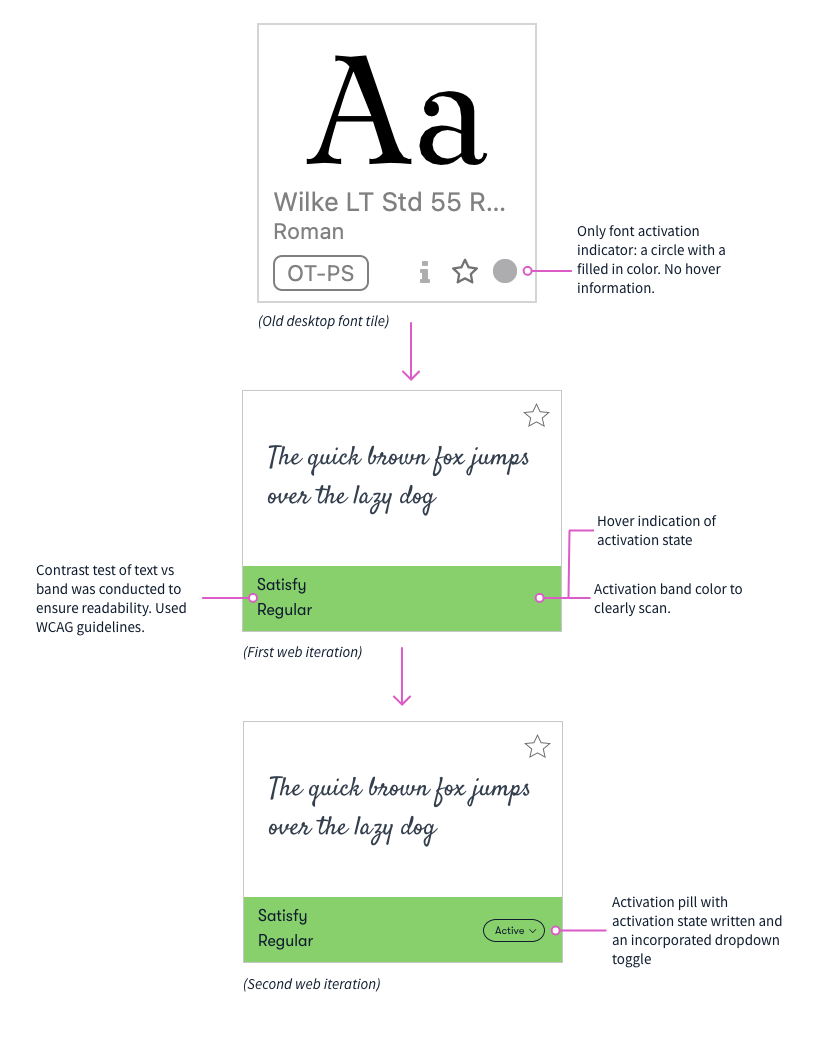
Accessibility
As we moved to the web, it was essential for me to that we started incorporating more accessible design into our products. I truly believe that a product is only as good as its usability to ALL its users. The old desktop product didn't really take this into account but there have been some small fixes that I have spearheaded in order to push this forward.
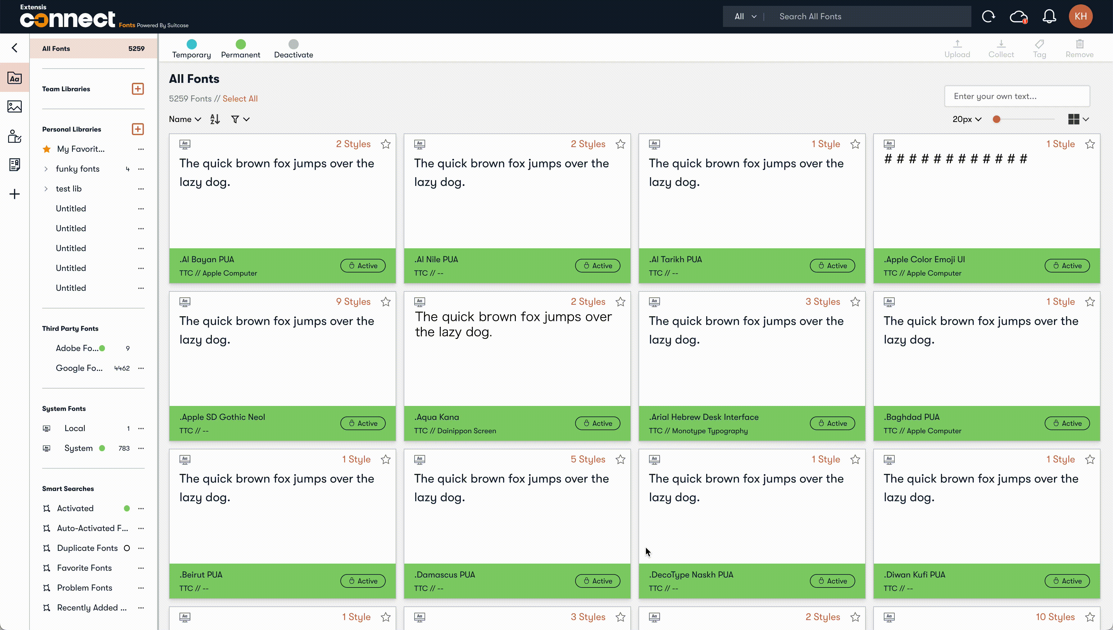
- Applying a pill to the font card clearly shows font activation status
- Accessing color contrasts based on our brand color palette
- Empowering key navigation
Moving forward, some additional changes that I have noted that could benefit all of our users:
- Adding an underline to all coral text buttons as it is not clear enough that they are clickable
- Test type sizing and color contrast to ensure readability throughout the product
- Advocate for a third-party assessment of our web clients accessibility score
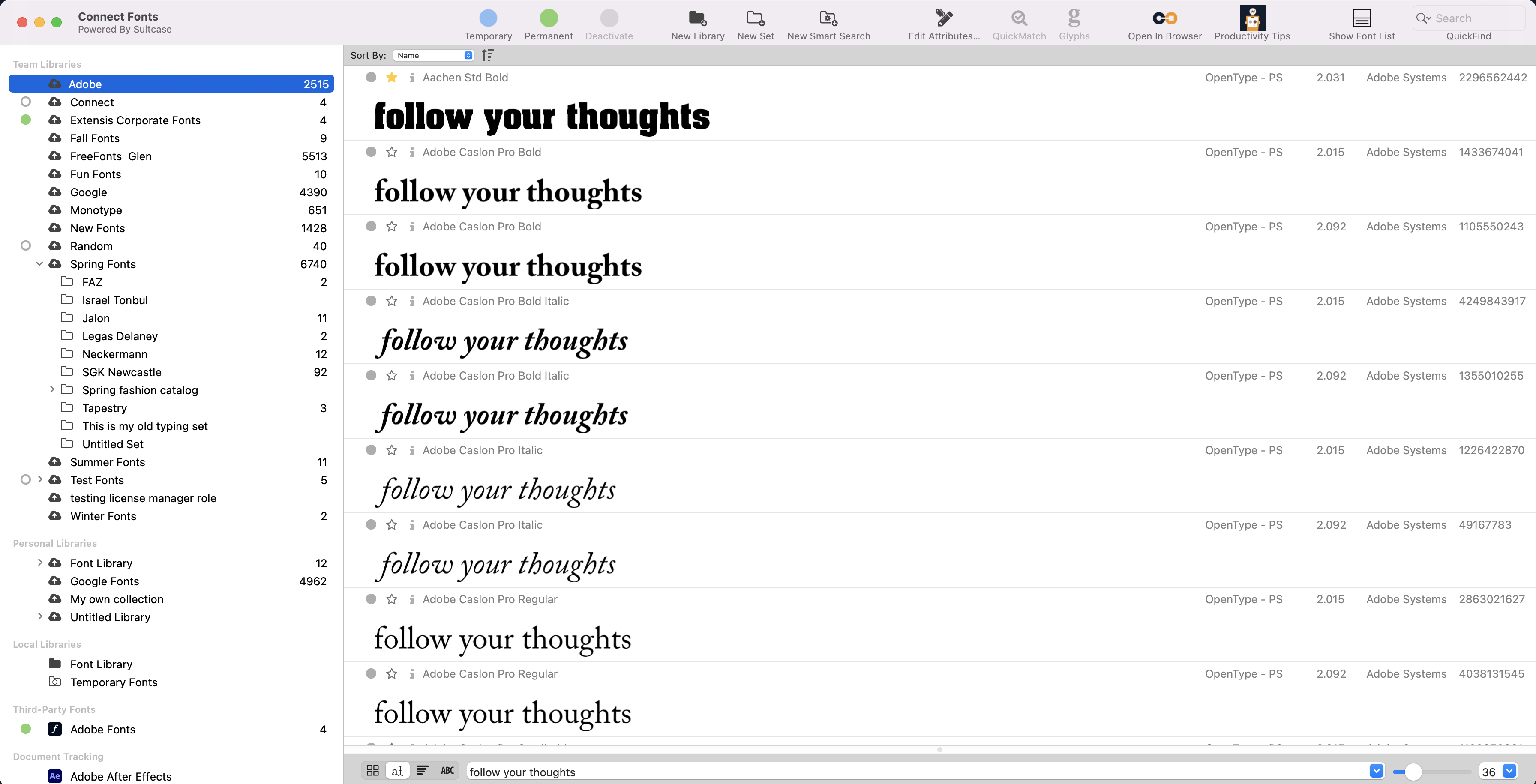
Current state
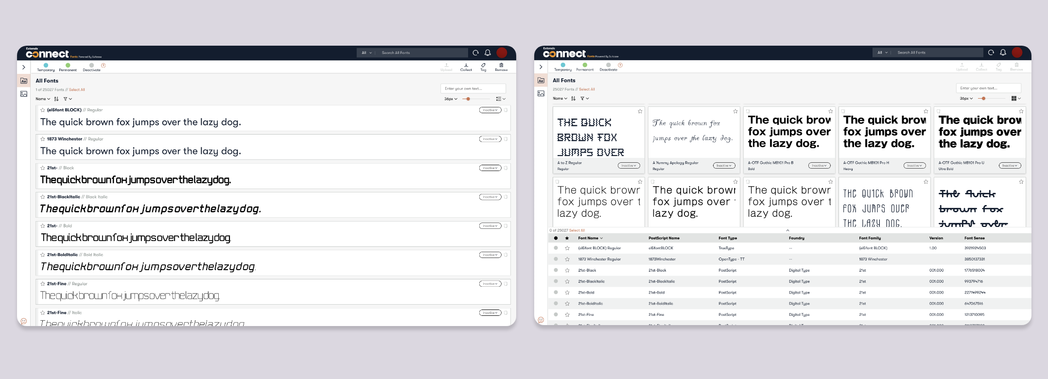
BEFORE + AFTER
Slide the bar in the center to see the difference between versions
Final Thoughts
LESSONS LEARNED
- Compromises with the engineering team don't mean that the desired outcome can't be achieved. I have worked on improving the Connect Fonts area for about 3 years now and there are still gradual improvements and additions being provided.
- Stripping things down to the basics is a very quick way to find out what users miss and actively use or never even knew existed. If they didn't know a function existed, was is because it wasn't discoverable or the problem wasn't painful enough to find a solution? This project helped me ask deeper questions of the why of decisions.
NEXT STEPS
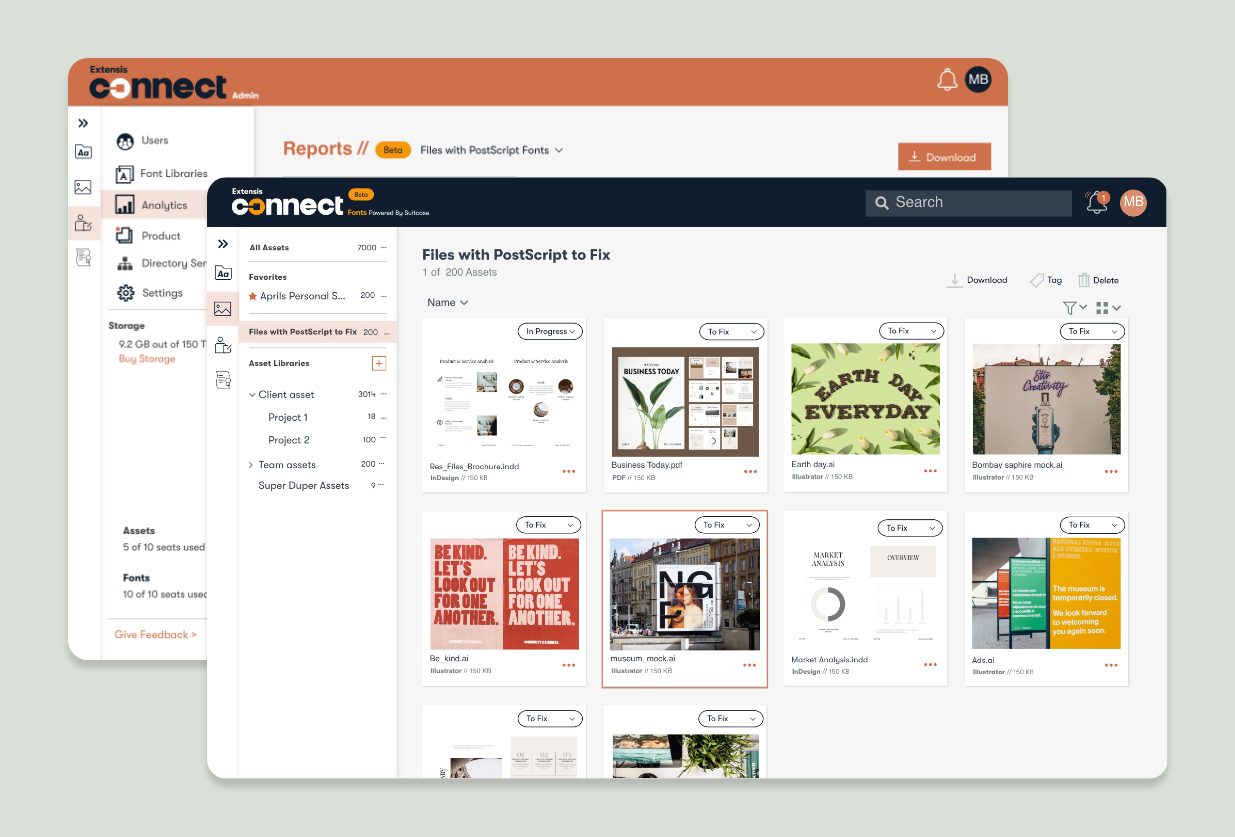
Extensis Connect is meant to combine multiple legacy products into one central cloud-based location. The Connect Assets area was built in unison with Connect fonts as a replacement for "Portfolio". The main steps moving forward is now creating a more seamless way to connect fonts with assets, areas that have historically been separated by different software but used in unison with each other day-to-day in the design space.
Additionally, there will be continued work on providing more of the functions that users already know and love into the product as items are refined.
Selected Works