SIGNA
Solving the doctor-patient language barrier
Challenge
Out of 63.2 million U.S residents (including native-born, legal immigrants, and illegal immigrants), 41% speak English 'less than very well' or not at all. This figure doesn't even represent tourists visiting the country with the same level of language skills. What would happen if they had to visit the doctor? What if there was an emergency and they couldn't provide the doctor with enough information?
Hospitals in the U.S and in the world have a deficit of translations, resulting in many patients sub-optimally using their children as translations or in worst-case scenarios, body language. This scenario can potentially lead to misdiagnosis and lack of information, making it hard for the doctor to properly treat the patient.
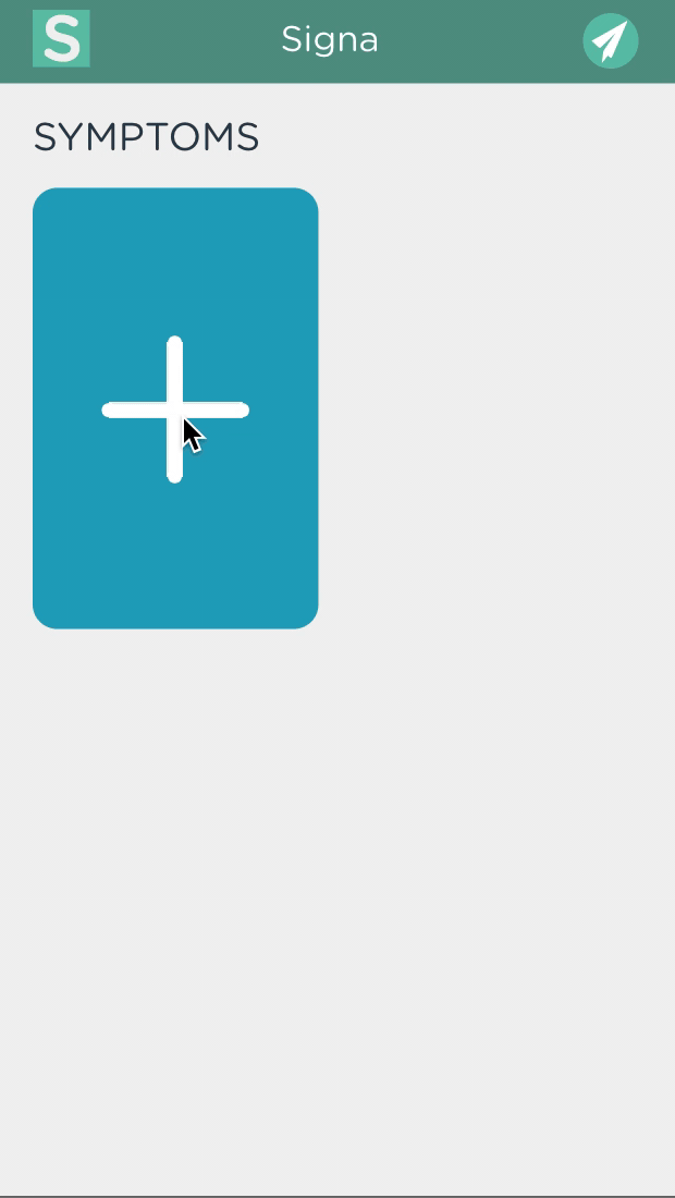
OBJECTIVES
- Provide a tool that helps with diagnosis when a translator is not present
- The solution must be usable for people with different levels of reading literacy
PROJECT SCOPE
Mobile Web Application
TOOLS
Adobe Illustrator, InVision, Sketch, Github, Vue.js
ROLE
UX Designer (Research, Interface design, Interaction design, design system, usability testing)
Jailene Cabrera + Feijie Zhou
DURATION
1 year
Research
* Research was completed taking into consideration HIPAA compliance and limited to personal resources
USER INTERVIEWS
We managed to interview two women that immigrated to the US with a limited level of English. They both had children that were first-generation Americans. Their children were their main source for translation during doctors appointments.
“ ..late, don't come at all, in a rush to leave, not available at every point of the appointment if they do come”
"... sometimes they don't have enough interpreters ... sometimes they don't show up or they show up too late to the appointment and I still end up needing help."
EXPERT INTERVIEWS
We had conversations that included Med/nursing students that had completed internships at medical centers. Additionally, we communicated with a doctor in the UK who confirmed that these issues are also true in the UK & provided insight to the design.
SECONDARY RESEARCH
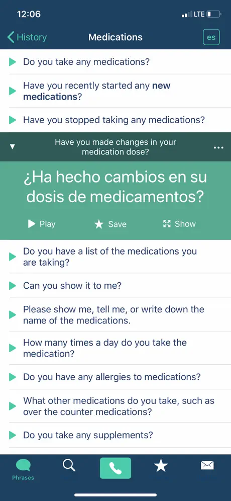
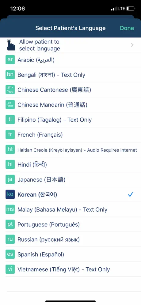
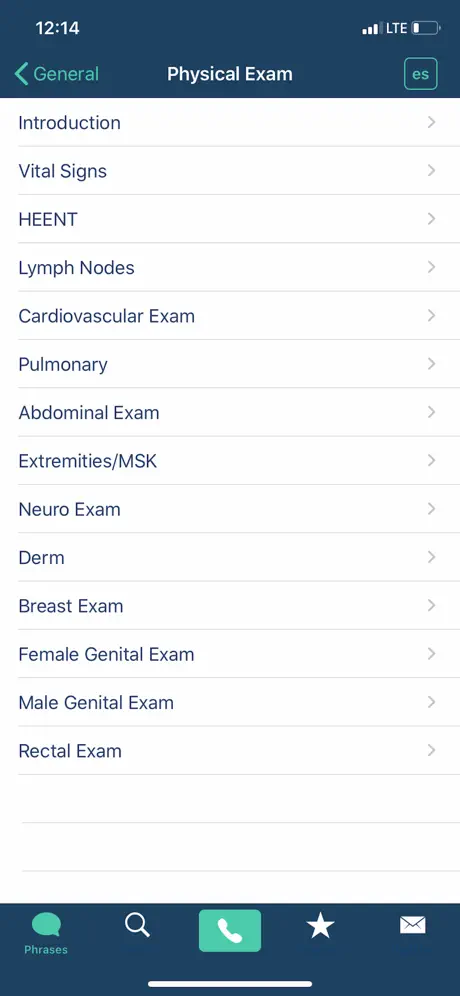
There is limited information that is openly available on the issue however, we used online resources to enforce decision making and backing up theories. Additionally, we did a competitor analysis that primarily focused on "Canopy Speak". Their app focused on the translation of the doctor saying something to the patient during the consult. There is nothing for the patient to communicate to the doctor on their app.
THE PATIENT EXPERIENCE
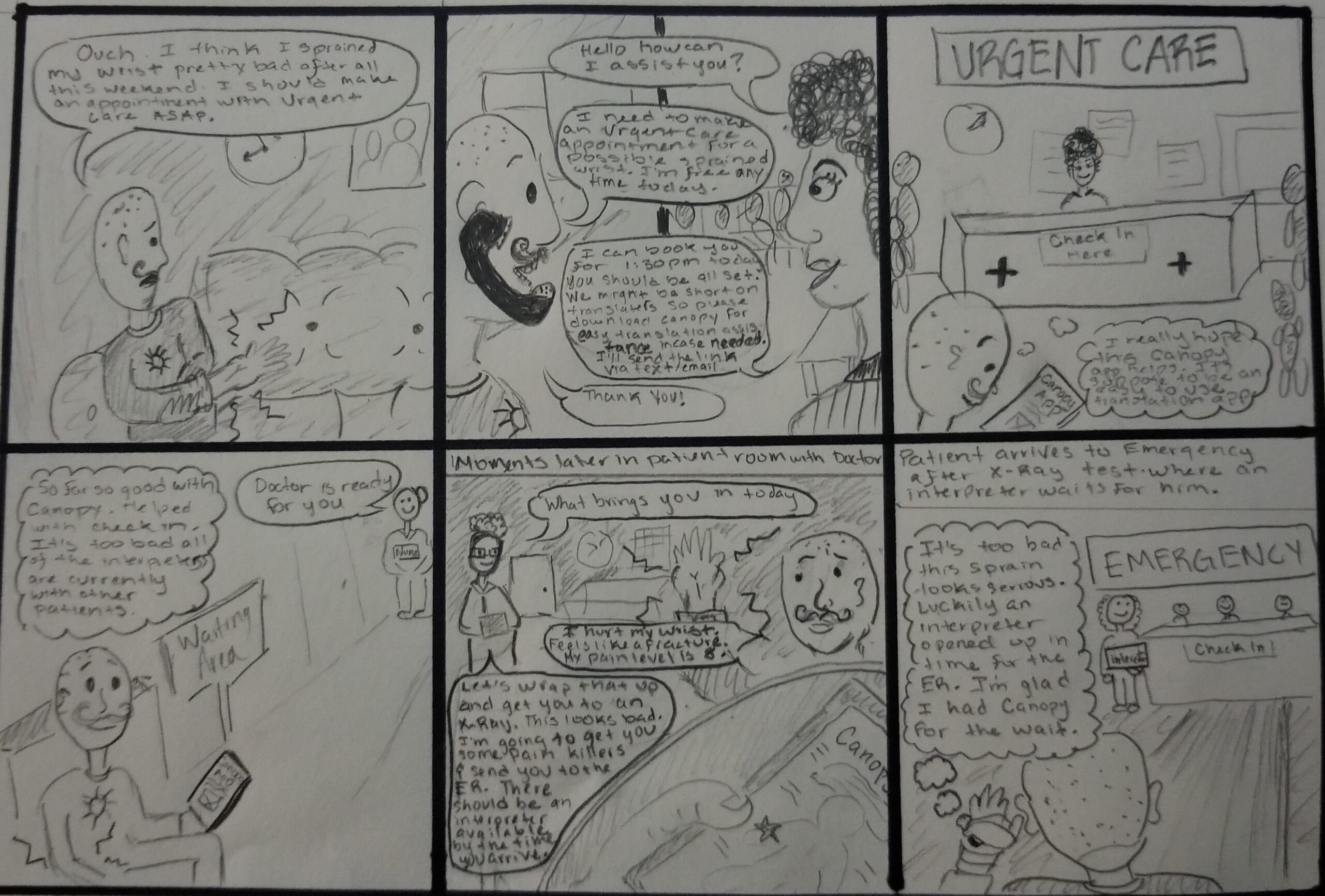
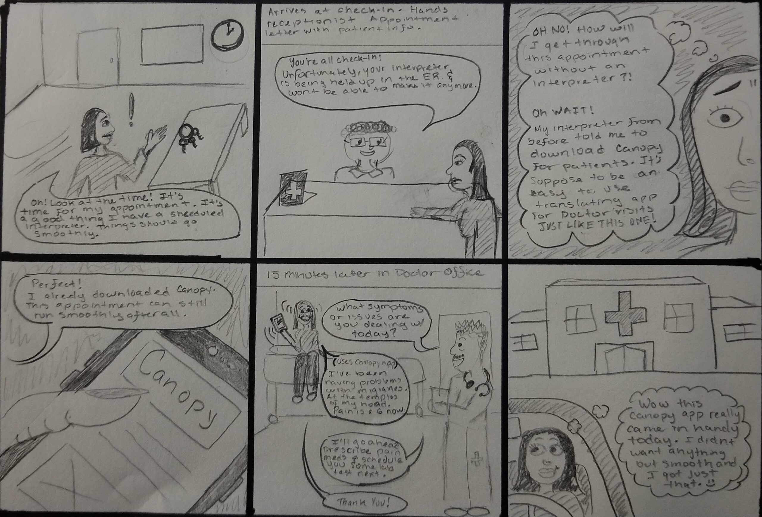
Storyboards - the Canopy Speak experience
**Storyboards were written entirely in English for the intended stakeholders to understand.The patient's dialogue should be imagined as a non-English language
As a way to understand our primary competitor and currently available solution, we created some storyboards following two successful stories of patients who use the app as a way to get diagnosed. It should be noted that we didn't storyboard unsuccessful experiences.
- Where does the app make sense in the patient experience?
- What scenarios do we see that the app can be useful?
- What does the patient experience look like using an app?
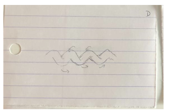
Current Patient Journey
We created a journey map to show where the patient struggles the most during the process as a visual to illustrate where our focus to help improve.
Primary moments of frustration:
- When the patient is unable to properly communicate what is wrong. Having to use a child or body language to explain symptoms
- When symtpoms worsen, persist or are unresolved due to poor treatment or misdiagnosis
Ideation + Prototyping
INITIAL CARD PROTOTYPES
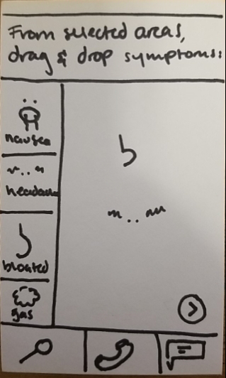
Separated into 3 main card types: Questions,Symptom and Descriptions (additive to symptoms)
Takeaways
- Large learning curve
- A lot of physical materials (messy)
- Confusing and overwhelming
APP EVOLUTION
Paper Version
We created a paper prototype that mixed ideas of selecting specific body parts in order to make a large list of symptoms less overwhelming. We incorporated ideas from both Canopy speak and Refugeye app. The content still felt dense and too bulky for the intent.
Digital Version
Focused on only providing symptoms for specific body parts and making it more accessible to use by segmenting in that way. Additional items can be added as feedback and tested are incorporated. This allows for the core of the item to be explored.
Desired Impact

Simple graphics
Intuitive + minimal learning curve

Increased diagnosis accuracy

Improve communication + decrease stress
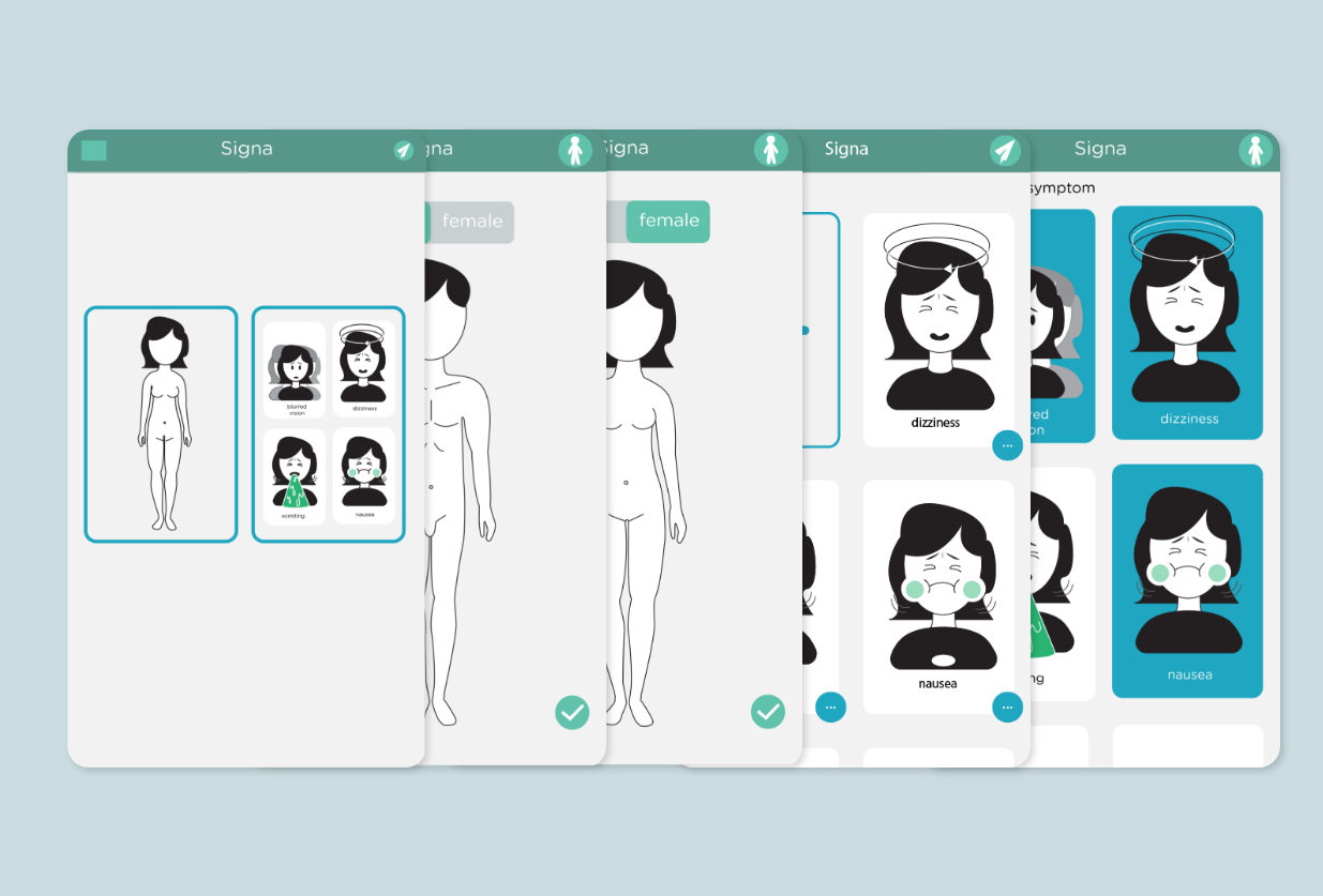
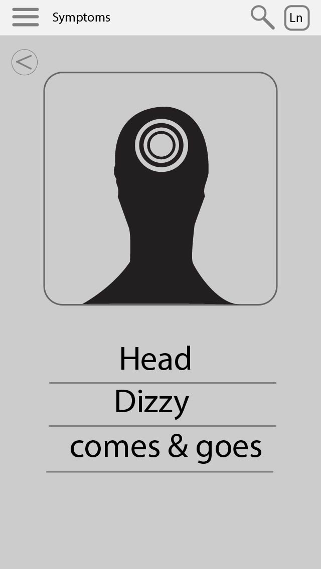
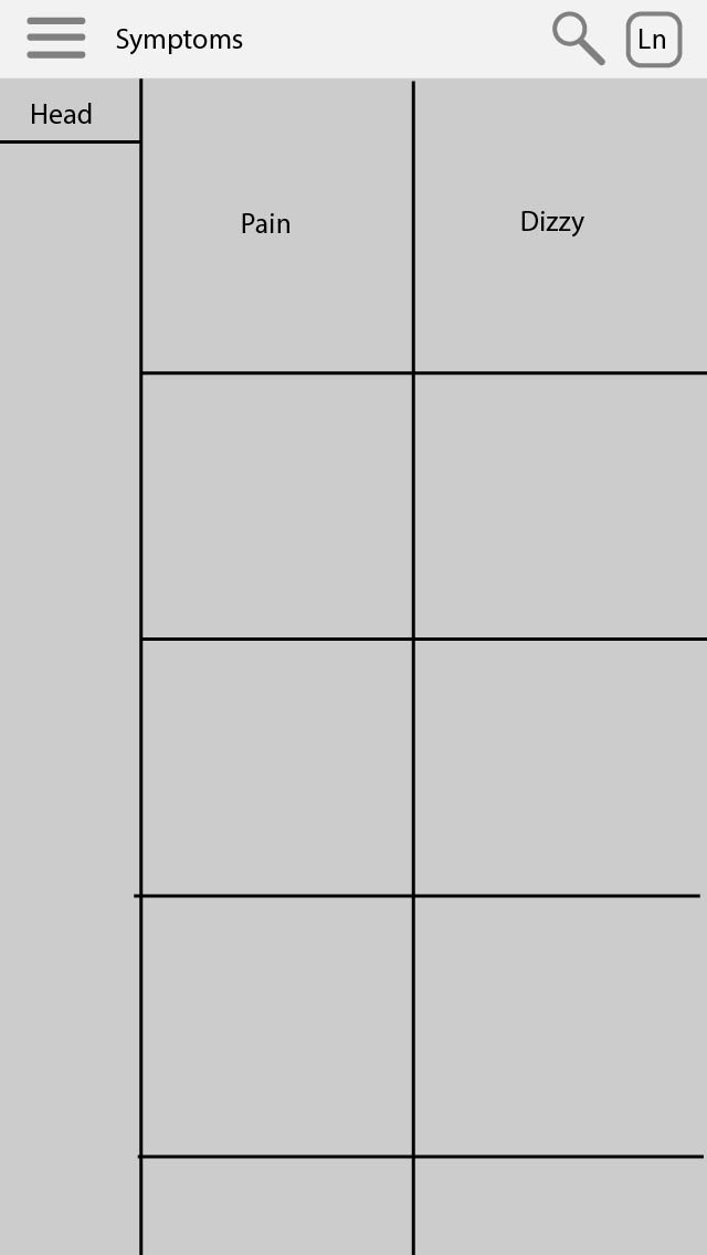
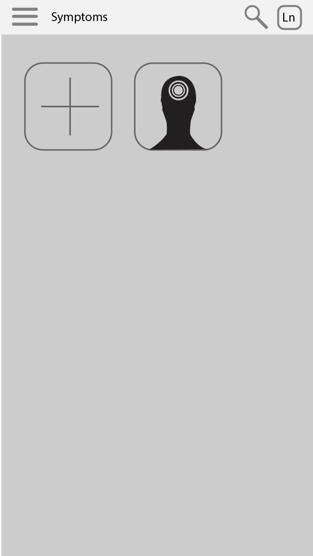
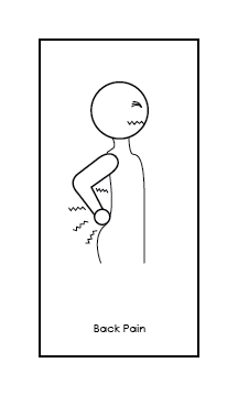
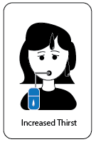
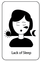
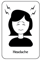
Visualizing Symptoms
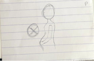
VERSION 1
- More details + body language
- Lack of simplicity
- Some symptoms hard to recognize/understand
- Genderless
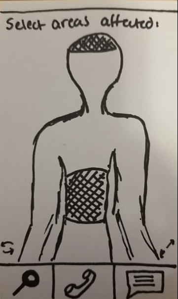
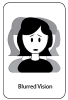
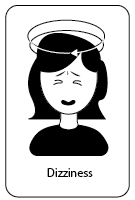
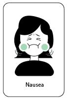
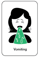
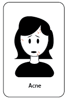
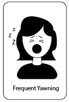
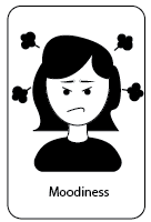
VERSION 2 + 3
Focus on the targeted body part
Black and white to maintain simplicity
Inspired by emojis and recognizable graphics
Rounded/ no sharp lines
- Introduction of color (max 2. per image)
- Rounding the bottom of the icons
- Elongate card to fit descriptive word
- Rounding the card edges
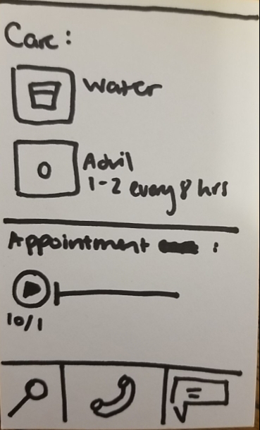
Solution
Patient app Journey
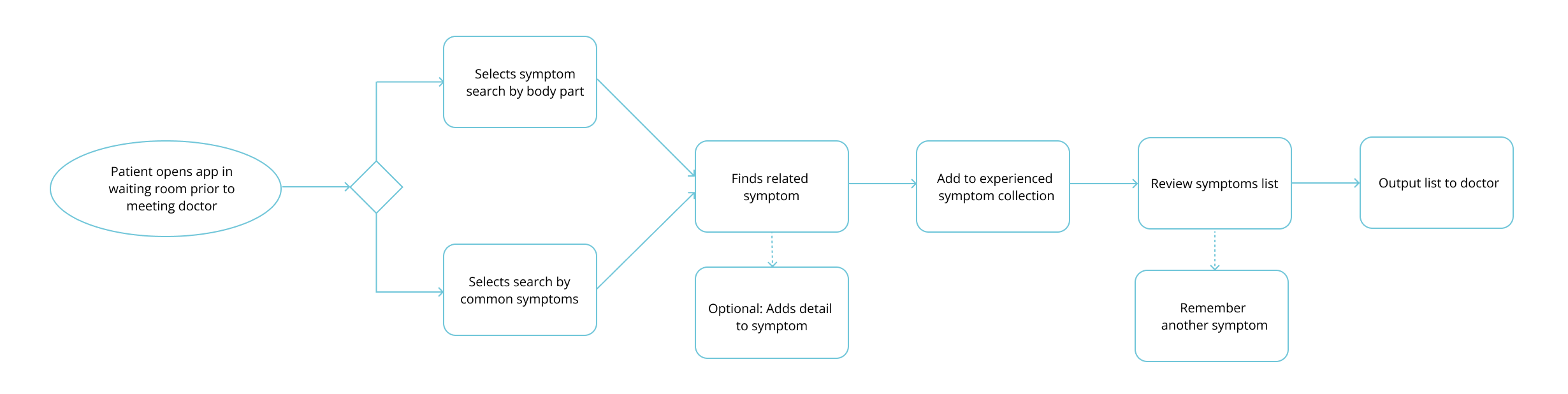
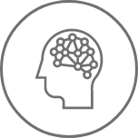
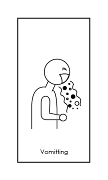
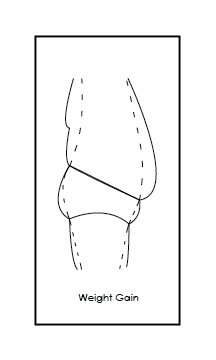
CURRENT STATE
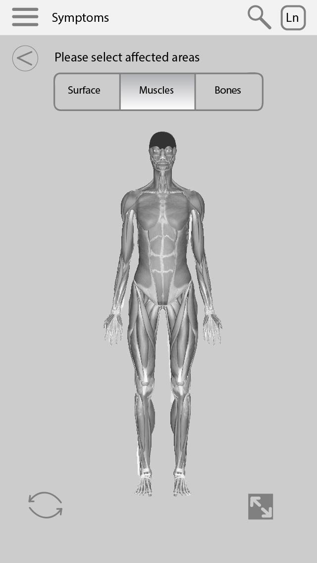
- General head and back symptom illustrations
- Completed MVP prototype of the above workflow based on head and back symptoms created
- Illustrations of both male and female patients
- (future step) intention to include a non-binary patient which will include both male and female symptoms necessary.
- (future step) intention to include a non-binary patient which will include both male and female symptoms necessary.
Next Steps
- User testing
- how intuitive is it?
- how easy is it to understand the symptoms?
- maybe simplify it for the first go around for COVID symptoms?
- how intuitive is it?
- Producing a genderless version of the cards and adding the option of a non-binary person with the option to select if the person gets periods
- Create symptom cards for other body parts
- Creating a better way to browse
- while still considering patients who are unable to read
Selected Works